American Flag PSD Design and PDF / JPEG/ PNG Download
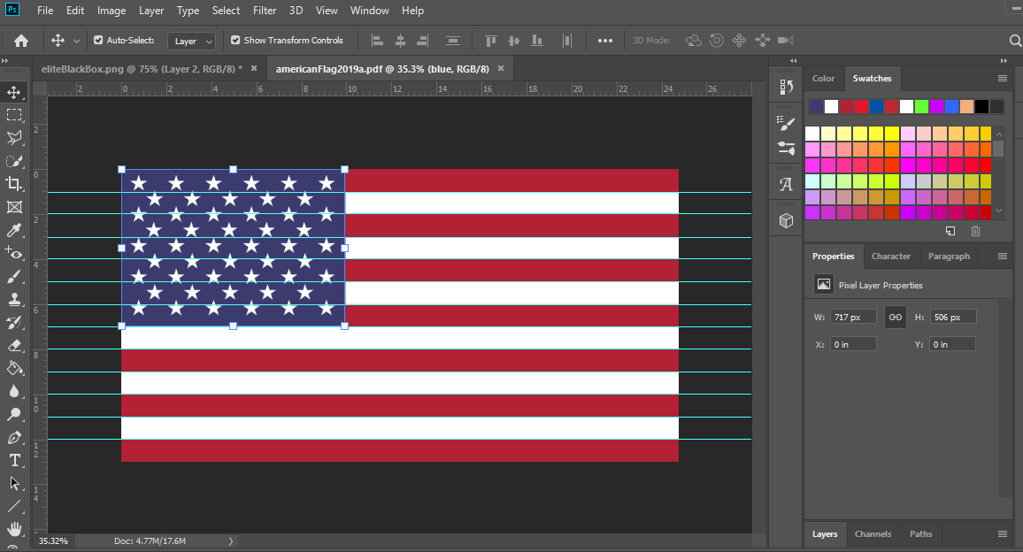
Hello my fellow Americans! I originally designed this American Flag in 2015 during my time learning Photoshop. I really had no idea how many specifications were involved in the American flag design, I really thought it was just some stars and stripes. Turns out there are a ton of rules when creating the flag. With that said, please just note that this flag design is a “solid effort” and very close to the official specifications, but if you need this for some sort of official government or military use, you may want to double check your work.
American Flag Dimensions / Technical Specifications
General Specifications
13 stripes in total
7 red stripes
6 white
50 stars
9 rows of stars total
5 rows of 6 stars (alternating)
4 rows of 5 (alternating)
American Flag Color Specifications
“old glory red”
Hex: #B22234
“old glory blue”
Hex: #3C3B6E
Flag Dimensions
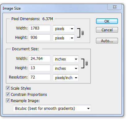
24.764″ width x 13″ height
Stripes should each be 1″ high.
Blue Block
Horizontal guide @ 9.8″
Vertical Guide @ 7″
*the blue block should take up about 40% of the width and go down about 7 stripes.
The Setup
Getting / finding all of these technical specifications is what took the longest. The actual specifications of the US flag is insane. Each star actually has its own specifications and there are a ton of more specs that were just too ridiculous of this simple project.
I setup my canvas based on the dimensions described above, basically 24.764″ x 13″.
I used these dimensions for the simple fact that it would make setting the guides for the stripes much easier.
The Design
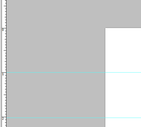
Next, I set the guides based on the above specifications. I made a ton of mistakes along the way, and even more later on.
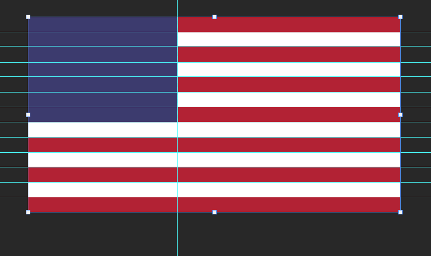
Eventually I got all the guides set nice and purdy.
The Blue Block
Once I got all the guides straight, the next logical step was to create the blue block. I set the guides 7 stripes down (or 7″) and 9.8″ wide. I used the selection tool based on these guides then filled in with old glory blue, or #3C3B6E (had to really dig to find that color).

Drawing the Stripes
Well, I didn’t really draw anything. The guides were already drawn so I just started to select each row and fill in every other row with old glory red, or #B22234
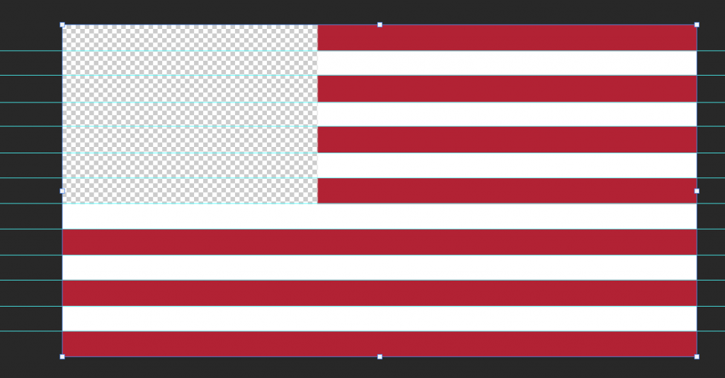
Highlight, fill. Highlight, fill. Rinse and repeat.
It wasn’t long before all of the stripes were done and now we are really looking like an American Flag!
The Stars
Now this was tough. This part really tested my patience, and I think I really earned a stripe as a designer tonight, no pun intended.
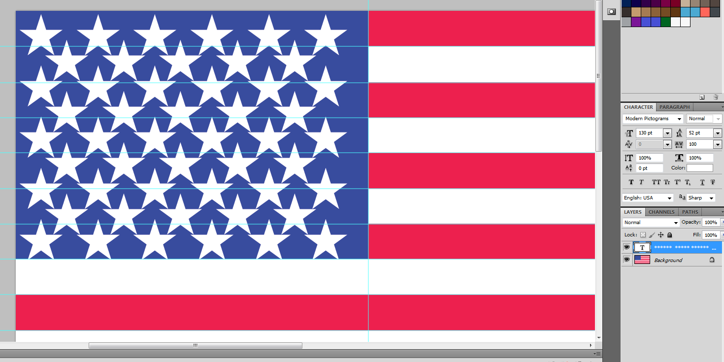
I felt the best method for this was to use a star from a font. That way I could type out the number of rows / columns I needed, then just mess with the tracking, leading, font size, and other parameters later on.
This process took me about an hour to figure out and get right.
This is how it looked when I first started.
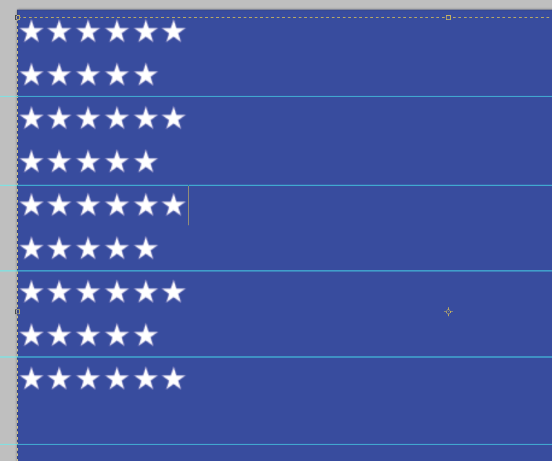
I didn’t see how I was going to be able to make everything squeeze together. I started messing around with the leading and tracking.
Things did not go well.
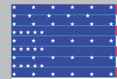
I started getting a little closer once I increased the font size. Finally we are getting somewhere.
![]()
(note in the image above and below, the colors look slightly off since I switched back and forth between RGB and CMYK, I fixed it in the final step)
But I still wasn’t even close to perfect symmetry. (this is the point where I said “forget it” to perfect specifications and just wanted to get it right.
At this point I finally thought I had it. 130pt font 52 tracking 100+ leading.
This is also when I realized that RGB color does not convert to CMYK, so I had to redo all of the colors which was easy.
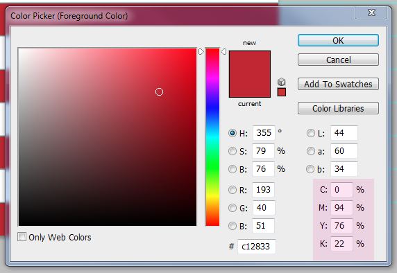
I looked at a “real” American Flag and noticed I was “off” in the star department.
I changed the font to 121 points, set the tracking to 52 and leading to 200. This made me much happier.
The flag is finally complete. I wanted to cry. No, I wanted to salute my beautiful flag.
I was proud to be an American at this point. Even more, an American designer. (ok, still a designer in training).
Finished Product
No matter how long I look at this, I find errors and inconsistencies. For example the padding at the last star row is greater than the padding on top.
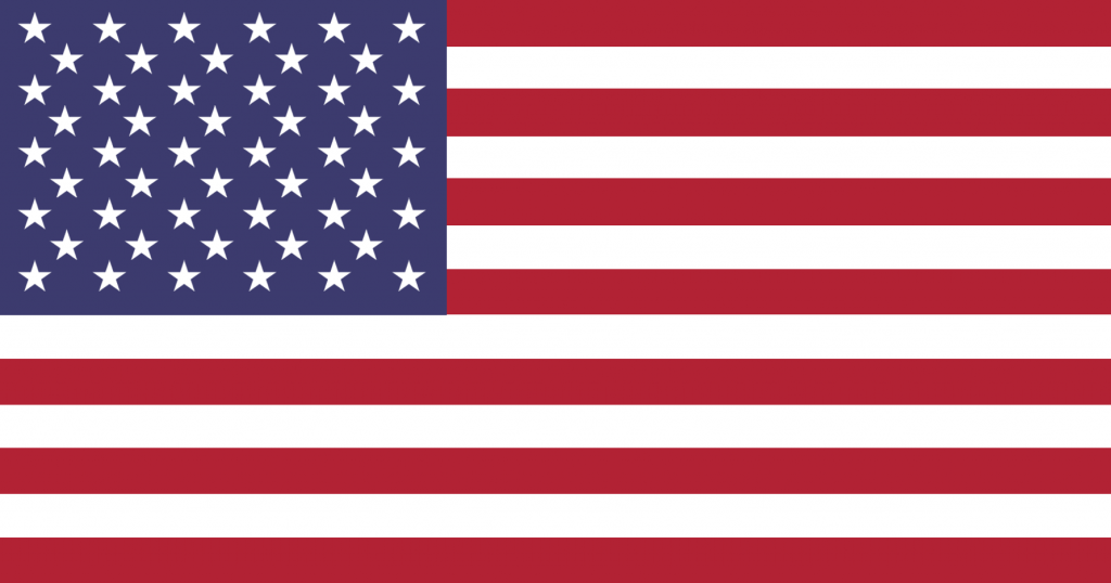
Designed in
Delray Beach, FL
Originally uploaded:
Jan 31, 2014
What I Learned
Today I learned so much about the design process. It really allowed me to give designers an all new respect. I thought this project was honestly going to be a walk in the park. I actually felt like I was cheating myself when I first started, but every corner I turned I learned something new.
Today I learned that design isn’t about art, it is about the user. It is about standards. It is about perfection and doing what is right.
There is way more to design than just design. There is so much research. There are so many unknowns.
My Personal Satisfaction
I’m very pleased with the end result of this. I could have spent another 8 hours on this project if I wanted to get every last detail correct down to the pixel. In one way, I am almost disappointed I did not but I don’t want to subject myself to that mania.
American Flag Desktop Wallpaper
If you are looking for a full-screen American Flag desktop wallpaper in 1920 x 1080 you can download it here for free, no strings. This image will take up most of your screen, with a small white border around the image.
American Flag Image Download
- American Flag PSD
- American Flag PDF
- American Flag JPEG
- American Flag PNG
