Print Design: 2015 Wall Calendar

This latest print design project is actually a gift for my wife. My wife loves calendars, and organizing things. I recently came across a new type of calendar while I was visiting a local business a few weeks ago. It has been stuck in my head ever since then.
What really stuck out was the fact that the entire calendar fit on one piece of paper. There was enough room on each day to make a small notation, mainly to keep track of large events such as holidays, birthdays, vacations, and other important notes.
There were a few things missing from the one that I saw that I wanted to add:
- a few lines at the bottom for a few general writing notes
- to have the major holiday’s bolded / highlighted
I figure if the major holiday’s are bolded, this will increase the user experience of the calendar by allowing the calendar user to not waste the space by writing the name of the holiday next to the line.
Document setup
I am sure there are a number of programs that would be more suitable than Photoshop to design this in, but I am most comfortable with Photoshop.
I overshot the dimensions of the calendar by double of what I thought just in case. I wanted the width to be about 3 feet (36″) max and the height to be about 2 feet (24″).

This was just a starting size, I knew I could adjust at a later time.
Getting the guides setup was the most tedious part. For the column (month) guides I spaced them apart using the ruler. Each column was about 5″ apart.
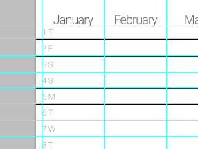
A zoomed out shot:
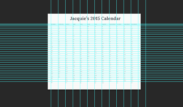
For the rows, I pretty much eyeballed this, and think I did not too bad of a job.

The calendar
By far the most difficult part was typing out every date and day of the year. Once I got into a groove, it got much easier. By playing with the leading and tracking of the font, I was able to get everything looking very symmetrical.
Once finished with all of the dates and days, I was able to get a solid preview of how it should look.
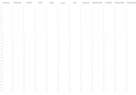
I knew I had to darken the font a tad, but also I wanted to switch to a serif font. After doing some research on serif fonts for print I ended up choosing “Lora” font for this job. I really liked the style of the font, and from what has been written about this font, it is very readable on paper.

I was really happy with the way it was looking now. I also chose “Lora Bold” for the heading of the calendar.

From here I was mainly just playing with the fine details, making sure all the fonts and rows matched up with the guides.

I also didn’t want the lines to be too overwhelming, so I played a bit with the line opacity for each row. Luckily they were in there own layer.

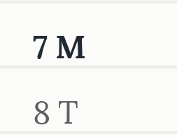
Finally I bolded and darkened the color of the major holidays. No April Fools or Groundhog Day, only the big ones.
Printing the calendar
I’ll be outsourcing the printing of this calendar since I know nothing about printing and don’t have any access to large format printers. Luckily we have an excellent blueprint company a few miles from our office in Delray. They’ve printed posters and other large format stuff for us in the past, and always have super fast TAT’s.
Within about an hour they had this printed and it came out looking great! My wife was super pumped about this and had a ton of great ideas on how to use it.
Downloadable PSD 2015 1 Page 365 Day Calendar
If anyone is interested in downloading the PSD, here ya go.